Some details of the previously-posted painting “Richmond: Irrelevant since 1865“:
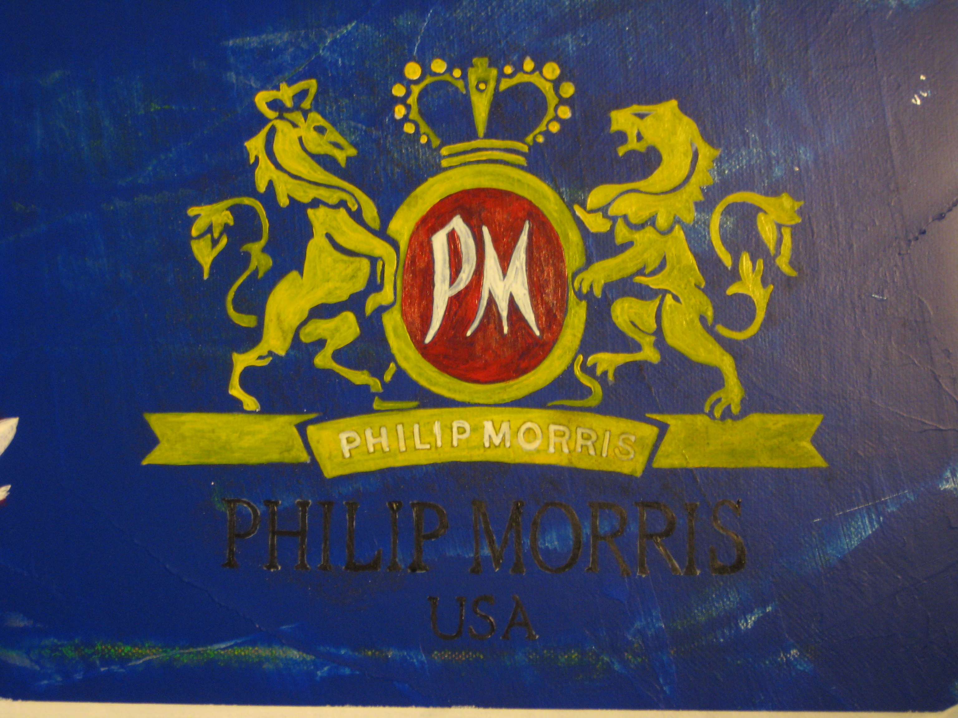
The Phillip Morris logo as it originally stood.
I thought the logo was painted with enough impasto (and garish color) as to still be visible once the grey cover-up was sanded down. I was wrong, however.
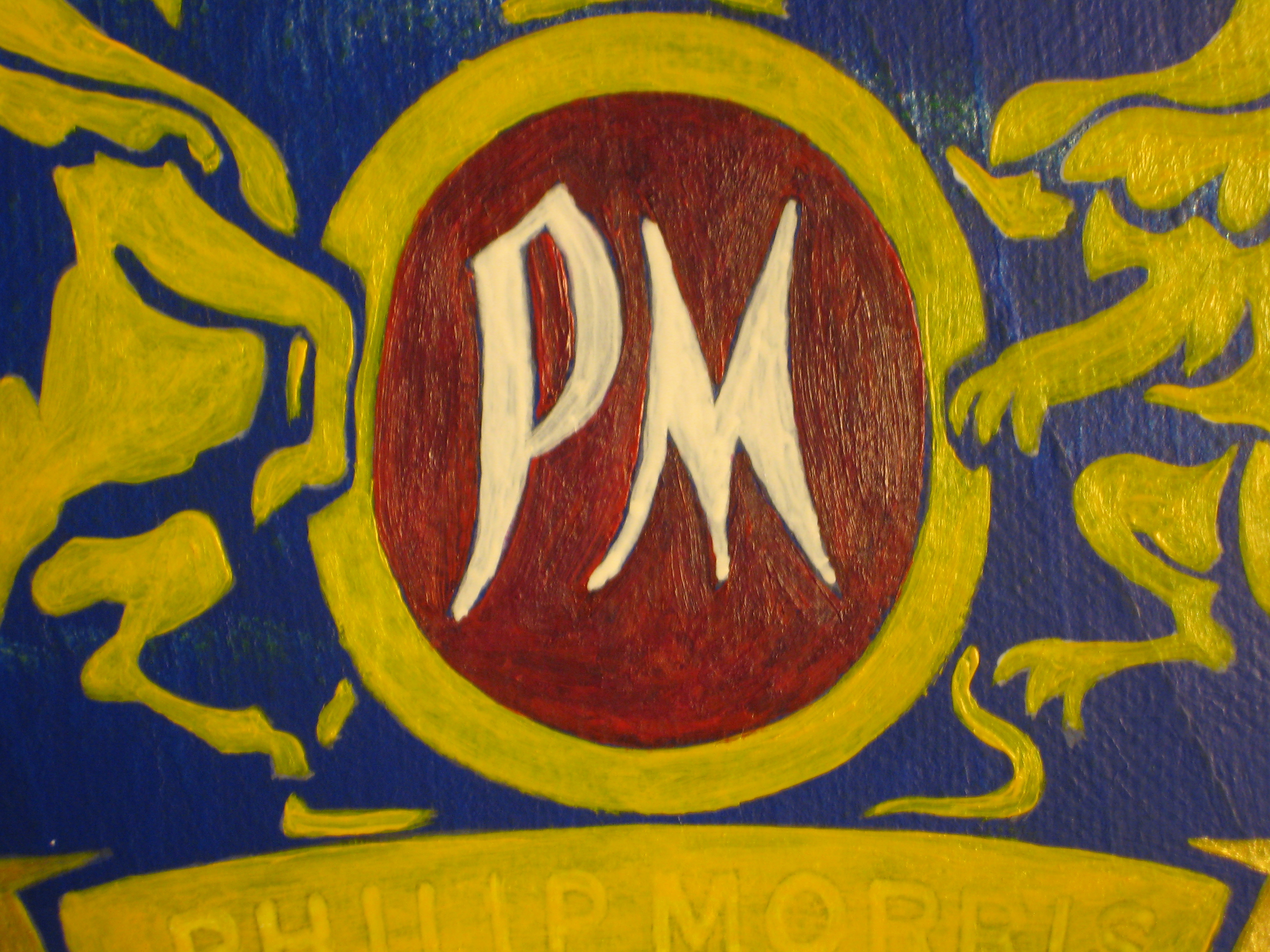
I’m notorious for glazing. This to me was impasto!
The underpainting was too thin (more of a glazing wash) and the top-coat of yellow and red got knocked down more than expected by the 200 grit sandpaper.
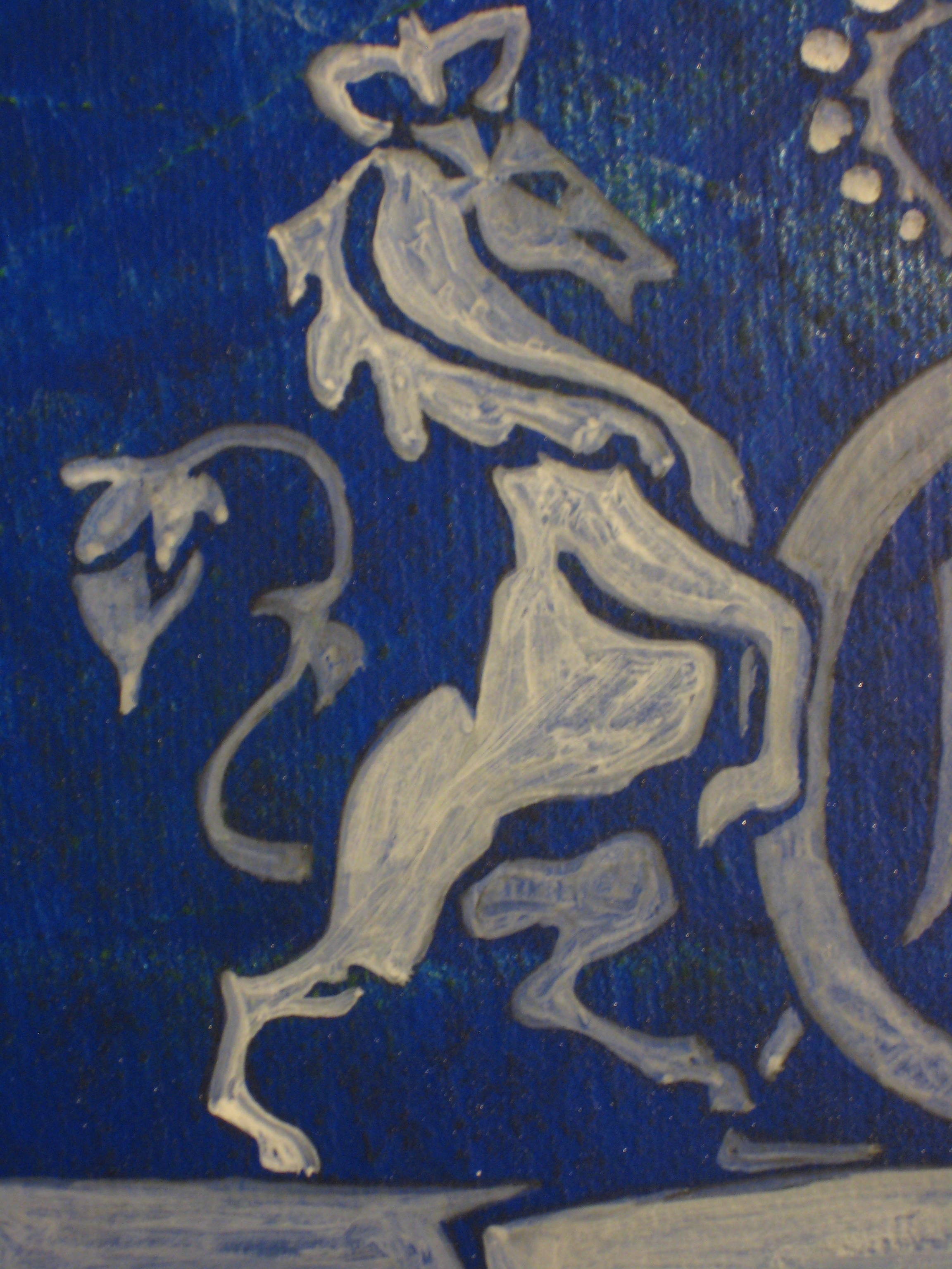
Some underpainting for the horse on the heraldic crest.
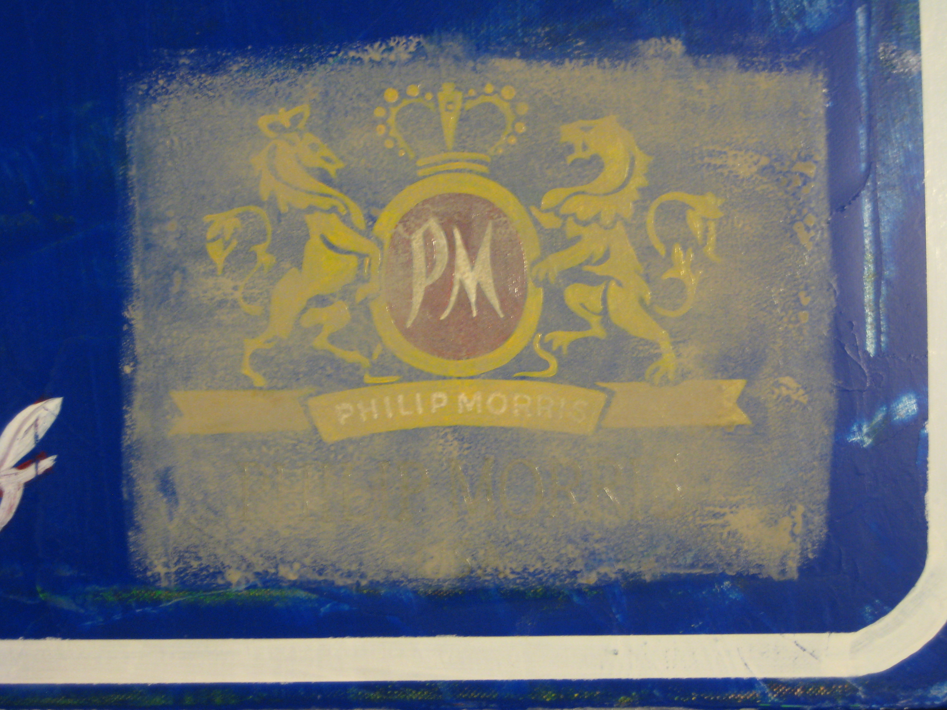
I thought the first layer of cover-up was too light/watery.
Double-layering the cover-up wasn’t helpful either and with a sanding in between the logo all but disappears:
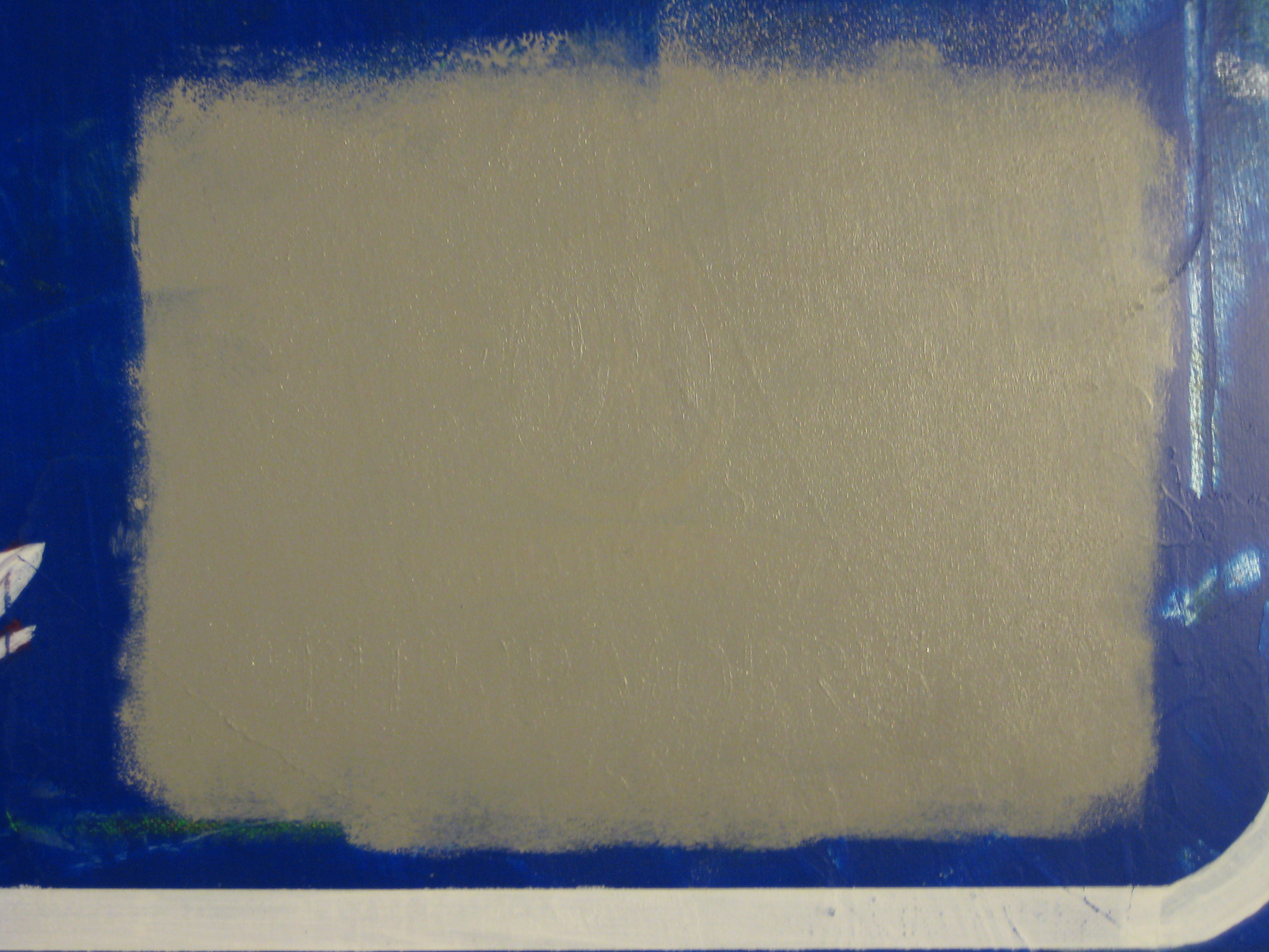
You can see the underlying texture with side-lighting but no visible color comes through for ghosting.
The next step was to add the logo for the University of Richmond but, as you can see, it lays awkwardly. I kept it this way intentionally; as if the government workers charged with the task of changing the sign were too lazy or uninterested in making a visually clear communication.
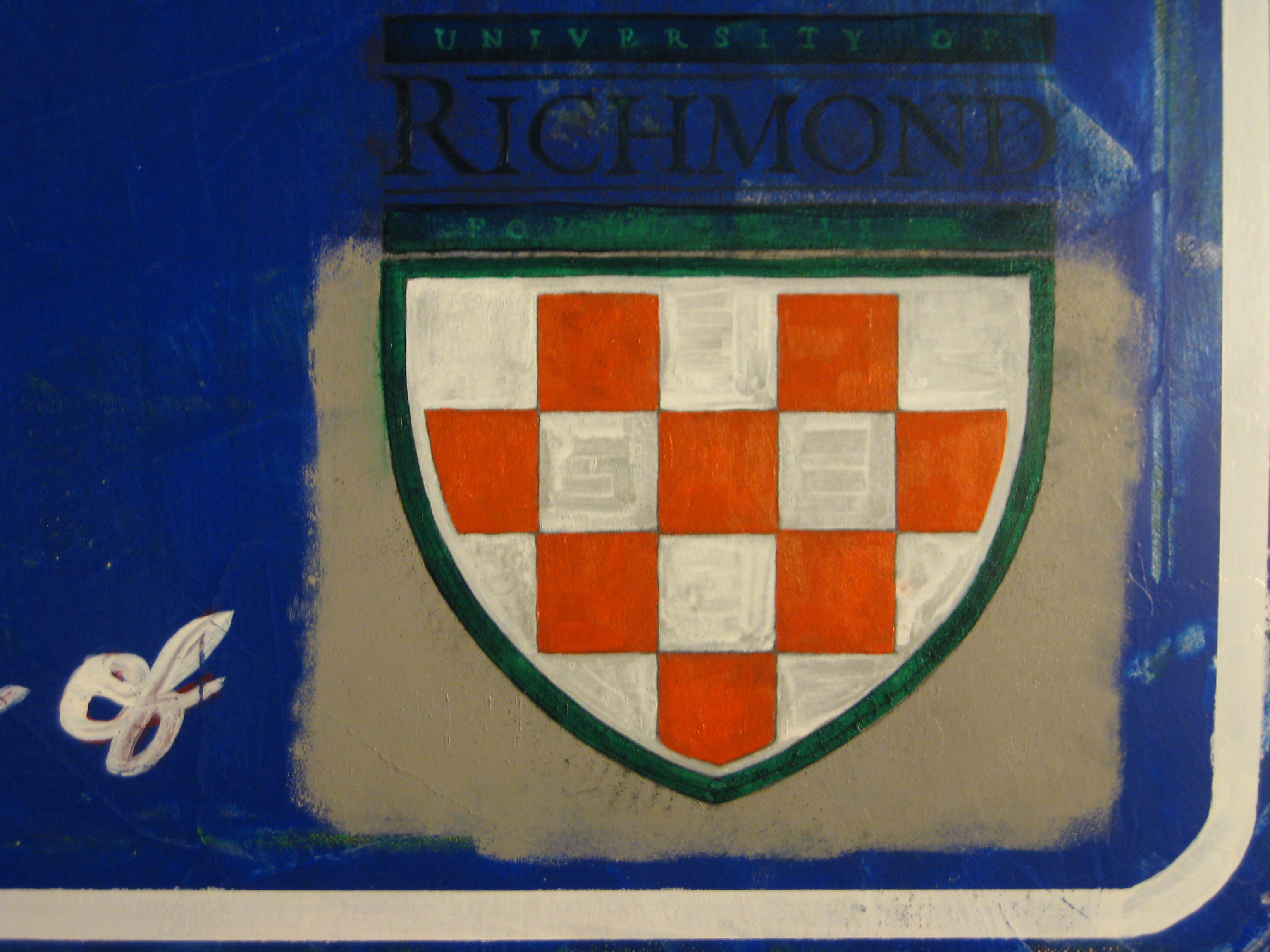
An underpainting of the UR logo, the final being more red and consistent.
Once “VCU” was added I sanded the shit out of it and was able to get some semblance of the original logo to poke through, albeit incomprehensibly.
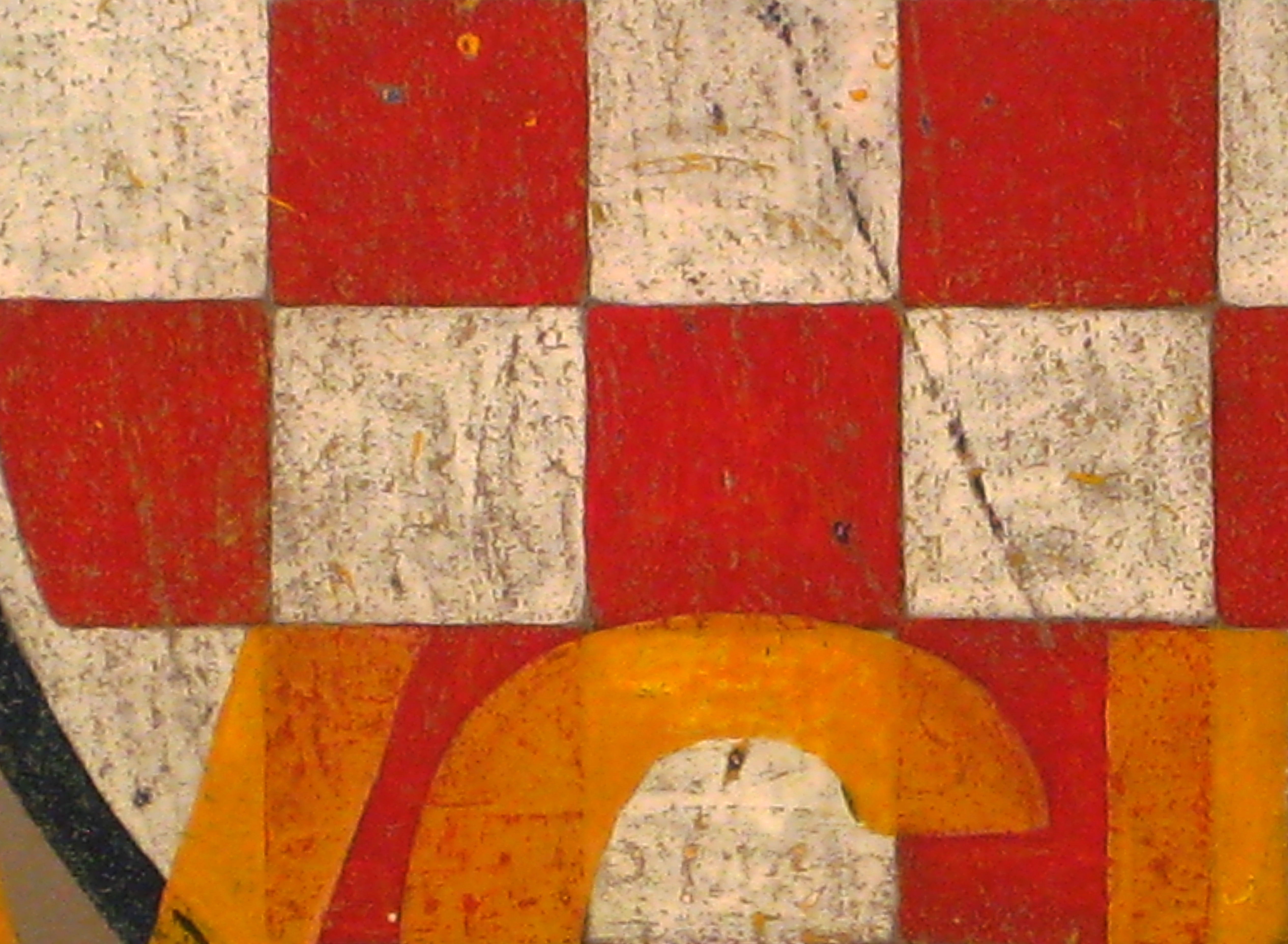
Getting rough with the surface starts to show a number of the layers of underpainting and the previously-“erased” logo.
Original painting here.
